Loading cart...
Trusted by teams at:


Browse our outdoor planters below, add likely sizes to your cart, then choose Checkout or ”confirm pricing and lead times” to request a quote for your project.
Where Outdoor Planters Work Hard All Year
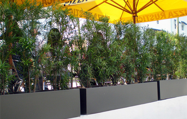
From hotel arrivals and storefront patios to rooftop terraces, pool decks, corporate campus entries, restaurant patio borders, and municipal streetscapes, these outdoor planters are built for real weather and traffic so high-visibility spaces keep looking finished.
Smart Buying Guide for Outdoor Planters
1. Choose Sizes That Read from the Street
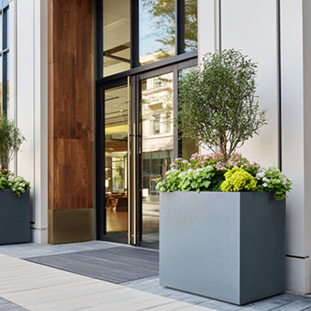
Focus on visibility from curb, approach paths, and seating zones, not only door height. With outdoor planters, you can maintain entries, sidewalks, and drive lanes for clear circulation while still giving plantings enough presence at eye level.
2. Plan for Weather, Weight & Drainage
Account for freeze-thaw, irrigation, wind, de-icing salts, and rooftop load limits, plus how planters move through elevators and docks to the install location. Then select materials, weights, and drainage so outdoor planters perform long term without surprises at install.
3. Coordinate Exterior Finishes & Lead Times
Emphasize matching railings, facades, decking, and brand colors across properties, plus working backward from opening dates to choose quick-ship vs. made-to-order outdoor planters. Confirm finish standards early so replacements and future phases still match.
Need a fast gut‑check on sizes and lead times? Send us your plans and we’ll recommend outdoor planter options for your project.
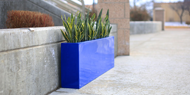
Outdoor Planters Built for Real-World Projects
Outdoor planters are more than a home for plants. They define edges, guide flow, and add structure in spaces that see real weather and real traffic.
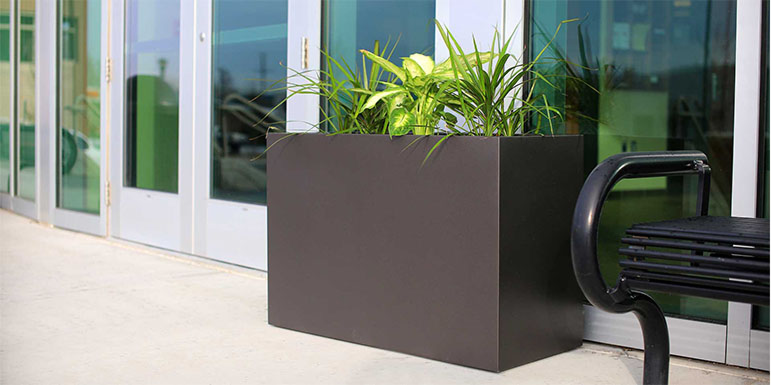
Our commercial-grade outdoor planters handle extreme temperatures, heavy use, and long-term exposure without cracking or chalking, while maintaining a clean, modern aesthetic. They are backed by a three-year warranty and installations that have performed outdoors for more than a decade.
Trusted Nationwide for Demanding Installations
Professionals specify our outdoor planters for:
- → Hotels & hospitality
- → Office towers & corporate campuses
- → Retail & restaurant patios
- → Multifamily developments
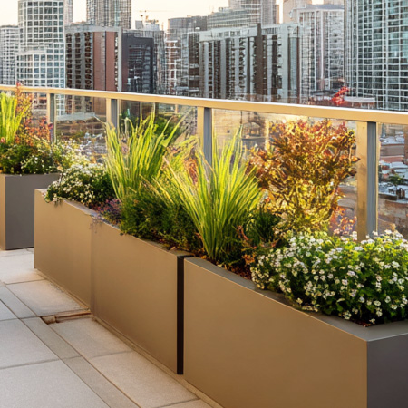
- → Rooftop lounges & terraces
- → High-end residential projects
Built for All-Weather Exposure
UV-stable exterior coatings resist fading and chalking in full sun. Non-porous fiberglass construction handles freeze-thaw cycles without cracking, unlike concrete. Resists pool chemicals, coastal salt air, and de-icing salts without surface degradation or corrosion. These outdoor planters do not need sealing, recoating, or annual maintenance to stay looking clean.
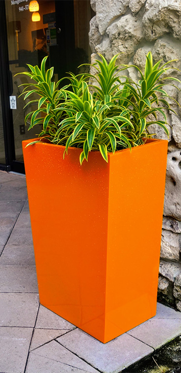
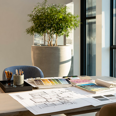
Match the Exterior, Not Just the Plants
20-plus standard colors and custom RAL matching so outdoor planters coordinate with facade materials, railings, decking, and hardscape across every location and project phase. Consistent finish across multi-unit properties and replacement orders. Color and sheen are specified in advance so planters arrive on site ready to install, not ready to repaint.
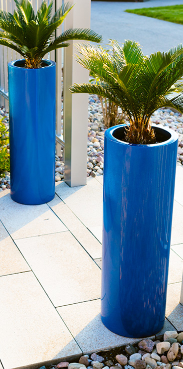
Sized for Outdoor Scale and Root Depth
Outdoor commercial planters need to read from a distance and support large specimens, palms, trees, and tall grasses that anchor entries and terraces. Engineered for the soil volume, drainage, and wall strength that large outdoor plantings require to establish and stay stable in exposed, high-traffic exterior conditions. Backed by a 3-year commercial warranty.
Frequently Asked Questions
Outdoor commercial planters need to handle UV exposure, freeze-thaw cycles, wind, foot traffic, and regular cleaning without cracking, fading, or corroding. The key factors are material construction (non-porous fiberglass handles these conditions better than concrete or most metals), drainage design, UV-stable exterior finishes, and a size and base footprint appropriate for the installation environment.
Yes. Our fiberglass outdoor planters are rated for year-round outdoor use including cold climates with freeze-thaw cycles. Fiberglass is non-porous, so water does not enter the material and there is no cracking risk from freezing. UV-stable exterior coatings maintain color and finish across seasons without chalking or fading.
Yes. Fiberglass is significantly lighter than concrete, which makes it the practical choice for rooftops and balconies where structural load limits apply. Confirm weight when fully planted and watered against the structural capacity of the deck or slab. For most commercial rooftop applications, the planter weight is a fraction of the soil and water weight, so the planter itself does not drive the structural calculation.
Yes. 20-plus standard finishes are available, and custom RAL color matching is available for larger projects. Free color samples ship on request so you can verify finishes against facade materials, railings, and hardscape before committing. For multi-location projects, custom color matching ensures consistency across phases and replacement orders.
Core outdoor planter SKUs typically ship in approximately 1 to 2 weeks from US warehouses. Custom colors, sizes, and finishes may add lead time. Contact us with your quantities and finish requirements and we will provide a specific lead time estimate for your project.
Yes. Trade pricing is available for qualifying designers, contractors, and property teams. No account is required to browse retail pricing or place an order. For larger project quantities, contact us for a formal quote including freight planning.
If You Need Outdoor Planters, We Are the Team That Makes Your Life Easier
We help designers and contractors choose outdoor planters and patio planters that meet deadlines, handle real weather, and keep high-visibility spaces looking finished.
When quality matters, our large outdoor planters deliver: front of house, patios, rooftops, and plazas.